

Tweet
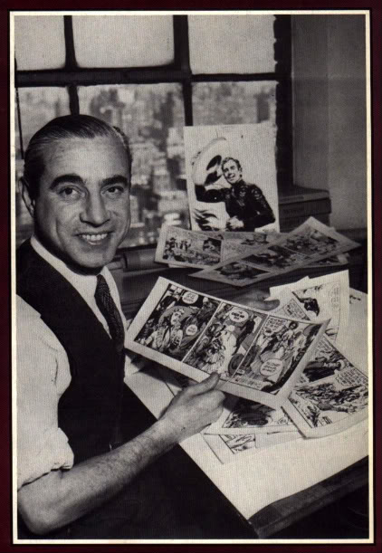 An Unsung Hero: Jose Luis Salinas
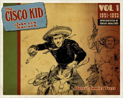
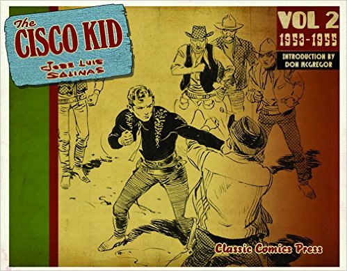
I'm pretty knowledgable about comics and their history. From the cartoonists that started the adventure strip genre way back in the early 20th century on through to the comics of the present, I thought I knew all the real masters. Then one day a few years ago I came across a comics strip from the 1950s done by an artist I'd never heard of before—Jose Luis Salinas. I was stunned! How could I have made it this far in life without knowing about Salinas's The Cisco Kid?!
The character of the Cisco Kid started in an O. Henry story back at the turn of the 20th century. The Kid has had many lives in pop culture across movies, radio, and comics. In 1950, at the dawn of the television era, The Cisco Kid became a TV show (in fact, the first TV series filmed in color, although almost no one ever saw it that way since almost nobody had a color TV set in 1950). To trade on the popularity of this new program, a daily newspaper strip was started, and Argentinian cartoonist Jose Luis Salinas was enlisted to draw it.
Salinas is among the finest draftsman to ever work in comics. I'd guess the reason you don't hear him praised as often as you do the "Big Three" masters of the comic strip (Harold R. Foster, Alex Raymond, and Milton Caniff—all of whom I need to tell you about sometime) is that he lived and work south of the border. (American's are sort of funny that way sometimes, only noticing things that take place in their own back yard.) Salinas was the equal of any of these legendary masters of the comics, and that's high praise from me because I love their work as much as anybody. But I defy anyone to look at The Cisco Kid strips and come away thinking Salinas isn't the equal of Foster and those other, more famous, artists.
Salinas's skill at drawing expressive faces and fluid, graceful figures was amazing. His mastery of even harder stuff—horse, western landscapes, background details, draping clothing and costumes—was just astounding icing on the cake. And the lighting and shadows—mind bogglingly beautiful! But this wasn't just slowy draftsmanship. All of this amazing artwork stood in service to the story and the characters, just as it should in any graphic story. Take a look (and keep in mind these aren't even his best strips, these are just a few typical dailies I found from a quick online search)...
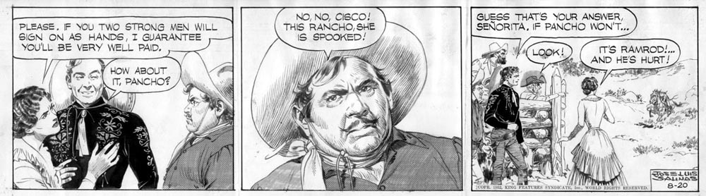

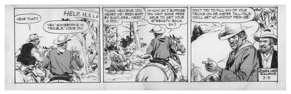
Admittedly, it's not very satifying to see these strips so small, and on a screen, but now you have the chance to see all Salinas's Ciscos up close and personal. It's always been easy to find print collections of renowned strips like Prince Valiant (Foster), Flash Gordon and Rip Kirby (Raymond), and Terry and The Pirates and Steve Canyon (Caniff)—all are American classics. Now, thanks to Classic Comics Press, Salinas's The Cisco Kid is just as easy to find, admire and study. Your chance to see the work of one of comics' finest talents is here at last. Take advantage of it...
Recommended reading: The Cisco Kid, Volumes One and Two—with more to come over the next few years. Full disclosure: the strips in these books are reproduced from the best sources available, but that usually means it was cleaned up from a printed strip published on newsprint sixty-some years ago. I'm sure a lot of the brilliance of Salinas's elegant line work has fallen through the cracks of time because his original art is impossible to find and shoot for reproduction. Still, there's abundant treasure to be found in these books, and this is the best chance you'll ever get to see Salinas's complete masterpiece. Don't miss it!
Creating a tone and style in your comics
Some advice on how to create a tone in your comics stories, and the role of art style in setting that tone...
Creating tension, character and emotion comics
Here are some tips on how to create an emotional connection between your story and your reader...
Establishing setting in comics
This week let's look at how to establish your story's setting when doing comics...
Plotting, pacing, and creating your story on the page
Another video this week! This time I discuss plotting and pacing your comics story. I also show you how I create a page of comics. Take a look...
Character design
This time I'm trying a new approach to giving you an art lesson: now you can get my advice straight from me in the video shown below! Click and learn.
 A lesson in perspective
One of the most challenging skills any illustrator has to master is the trick of drawing in perspective: the rules of how to make things look dimensionsal. There are very strict giuidlines that need to be followed to give the things you draw the illusion of depth and a realistic sense of space. Drawing things in perspective is like math: there are no shortcuts—either you follow the rules and your drawing looks correct, or you don't and your viewer knows it instantly.
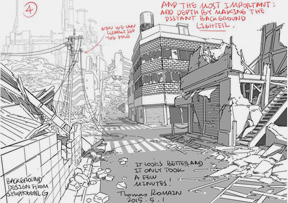
I considered doing a post here about the basic rules of drawing perspective, then I discovered someone else had already done it (and better than I would have!) And so, here a link to this wonderful lesson in perspective drawing from Thomas Romain, an anime artist living in Tokyo. He draws backgrounds for animation for a living, so he knows a thing or two about perspective.
Creating a page of comics—start to finish
Every artist has their own tried-and-true work methods that they've developed over years. Here's an inside look at how I currently create comics pages: the images below are from a new project proposal I'm working on. Let me take you through my process, step-by-step.
Of course before I start any pages I already have my story outlined and my characters designed. Don't even try making these things up on the fly as you start drawing pages. You'll waste tons of time and effort if you start pages before you've nailed down what your story is from start to finish, and what your characters look like from the front, back and sides. Kids always want to get right down to drawing pages before they've laid the groundwork, but it's a recipe for disaster. Once you've got your story and character designs in the bag, then it's time to start drawing pages. And the first step in that process is...
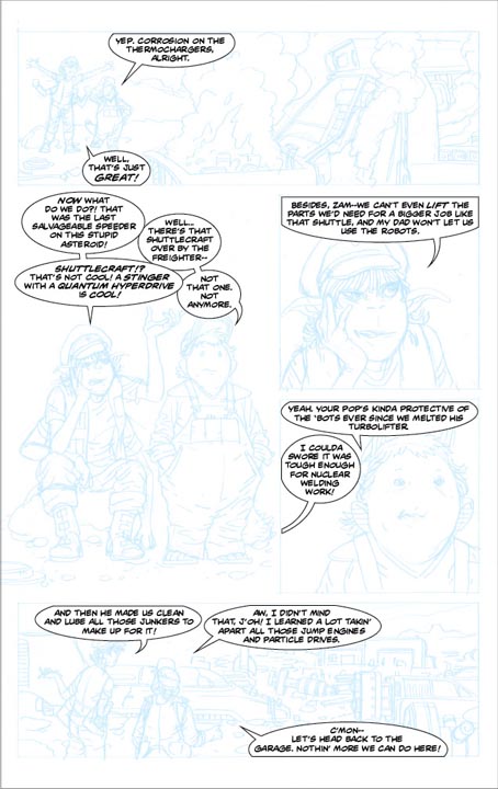
The Thumbnail Sketch: I've already written about the importance of planning your page with a small sketch. You can read about it here. That said, here's my thumbnail for the page we're studying today...

Notice it's very loosely drawn. That's because it's just for me to see, to figure out panel arrangement and plan what each panel will show. Also notice I plan facing pages in a book together as a spread. These pages will be seen together by the reader so I like to design them together. I also make notes on the side to remind myself of important story points I need to include in the art. Next comes...
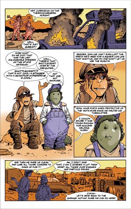
Pencils: I pencil my pages on 11" x 17" tracing paper, working out the details of the plan I started in the thumbnails. However, I'm always free to change my mind if I have a better idea for showing something or telling the story more clearly. You'll notice that happened here—the compositions of both the first and last panel are different from what I had in the thumbnail. That's because I figured out a better way to show those scenes (but the thumbnails still served as a reminder of what story point I need to make in those panels, even though I didn't go with my original idea on how to show it).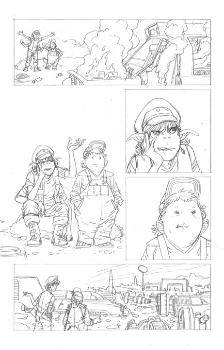
My pencils are leaner and rougher that some other artists. That's because I'm the one who'll be doing the finished art, so I can refine my drawing later on—but more about that in a bit. For me, the next stage is...
Dialog, lettering and balloons: This is a way of working that's pretty unusual, but it works for me because I'm the writer and artist rolled into one. I like to make the pictures tell as much of the story as possible, so art comes first for me. Then I script and letter dialog to fit the penciled art. This way I'm careful not to overstuff my pages with too much dialog. If I do find I have too much to say and not enough room to say it, I'll use Photoshop to shrink a figure down to make room, but I try to fit the words into the picture rather than the other way around.
Once I've got words and pictures working together, I use InDesign (the program in which I assemble the pages and lettering) to turn the pencils blue. Then I turn off the lettering and balloon layers in the program and print the blue artwork onto a sheet of Bristol board so that I can start...
The Inking: This is where the artist really gets down to the task of rendering the drawings in ink, whether with a pen or a brush (I use both, but mostly pen on this page). By this time all the mechanics of storytelling are solved, and all the compositions, perspective and figure drawing are as you want them. Now it's time to finish them off pretty. I ink right over the top of the blue pencil art, knowing that when I scan in the finished page I can easily make the blue lines disappear in Photoshop, leaving only black. When I ink, I'm keeping an eye on line contours and weights, cross-hatching as needed to create minimal tones, and making decisions about shadows and black areas to give the drawings depth.

Then the finished, crisp, clean line art gets scanned back into the computer for...
Color: All the coloring is done digitally, either in Photoshop on my Mac, or, in this case, on my iPad Pro in an app called Procreate, which I've written about here. Then the color image is brought into InDesign to replace my pencils and join up with the lettering and balloons I created previously.
That's it—from start to finish! Every artist has his or her own way of working, but this is the best work flow for me—at least until I find some brilliant new tool or way of doing things that works better (and believe me—all artists are always on the lookout for a way to speed up or improve their work.)
Now get out there and see what works for you!
Wally Wood's 22 panels that always work
The great comic book artist Wally Wood once diagrammed some ways for comics artists to stage interesting scenes even when there's nothing more going on than conversation. Quiet scenes with no action can be a real problem for graphic storytellers: how do you make characters simply talking into something visually interesting. Here are a few of Wally Wood's solution to that problem...
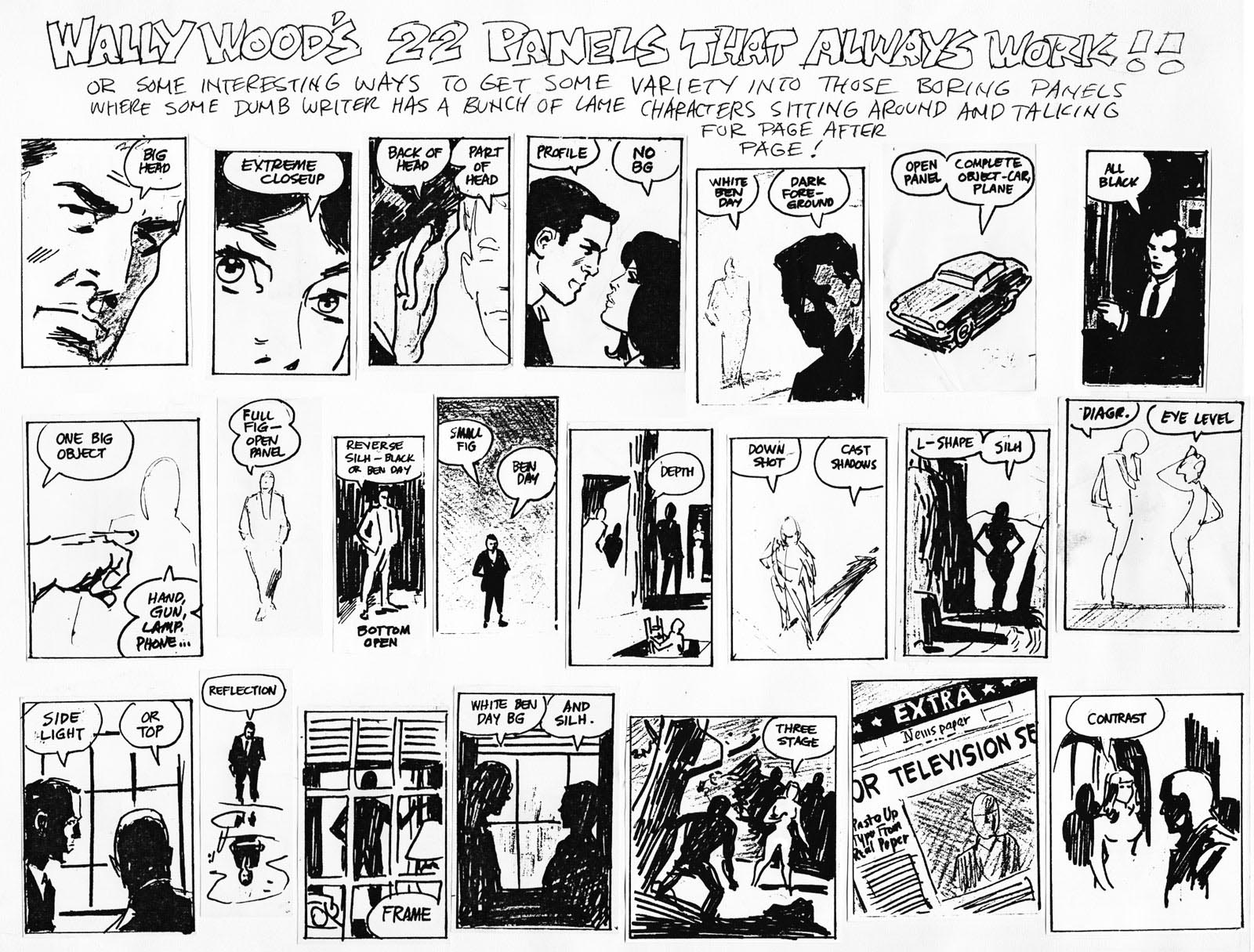
Next time you're stuck for how to compose a scene with nothing much going on, take a tip from Wally!
Recommended reading: some of Wally Wood's work isn't appropriate for kids, but you can see some of his best kid-friendly work on display in a collection of his work for MAD magazine, and in work on those 1960s superhero super-spies, the T.H.U.N.D.E.R Agents.
When the panels become real
I've written before about how to use panels on a page so that they don't confuse or distract the reader from the story you're telling them. I've also written about comics that stretch the principles of page layout to get across a certain idea or feeling. Here's a different wrinkle on these topics: what about when the layouts and panels become real spaces for the characters on the page? This is a storytelling device that's unique to comics, and it's great for telling unusual stories that require unusual measure to move the action along.
I illustrated an book called SMASH! (coming out in April of 2017) that called for some very unusual layouts to get its ideas across. SMASH! tries to teach the reader about the science behind the Large Hadron Collider, a huge machine in Switzerland built to study the the sub-atomic structure of the universe by colliding atoms at super speed and examining the particles that result from the crash! The characters in the book discuss a lot of things that can't be seen my the human eye, but my job as the artist was to find a way to demonstrate and depict the ideas discussed. At the same time, I had to keep the characters involved in the action. This called for some creative thinking about how to use the layout of the pages. Here are a few examples:
As the kids in the story start discussing things they can't see in reality, they wander out of the panels containing "real" settings, and into a world of imagination. Outside the confines of normal panels on a page, they meet long dead scientists and examine huge atoms. The simple act of walking out of the "real" panel and into this weird place where anything can happen opens up the possibities of what I can show in the story. Notice at the bottom, when I have to use panels to contain close-ups in this world of the mind, I use a different sort of panel—one with rounded corners—to cue the reader that we're still in this unreal setting.
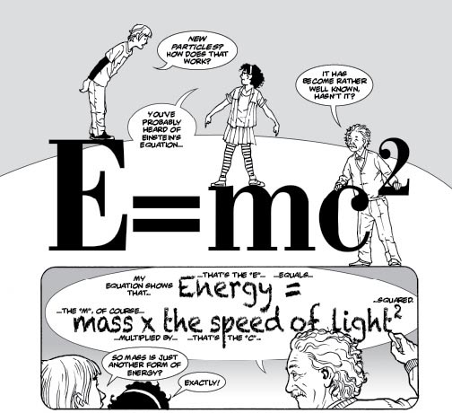
On the page below the kids in the storydiscuss Albert Einstein's theories, and Einstien himself shows up to explain his thoughts. This is an impossible dialog (Einstein died long before these kids were ever born) about a complex subject. How do I get these people and their abstract ideas together in one space? It's easy if that space is a page of comics: I can turn the text of a word balloon into a solid object the characters can stand on, or I can have Einstein write out and explain his formula within the confines of his own word balloon! The setting of the story has become the narrators' imagination.
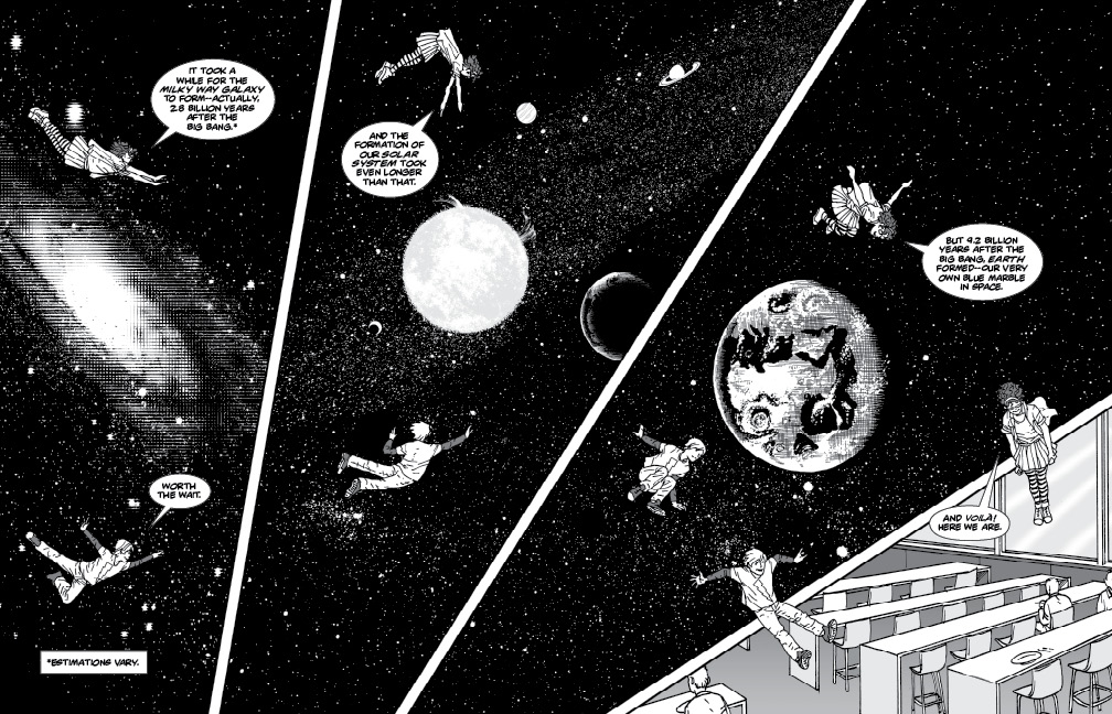
In the scene below the kids discuss the Big Bang and the formation of the univese. The discussion actually takes place in a cafeteria, but I let their imaginations take them across space (and the page!) to see the places and events they're discussing. As the discussion finishes, the kids gently drop across the panel borders back to the cafeteria to finish their lunches.
These strange ways of using panels and pages can be great devices for tell unusual stories. Just make sure when you do this sort of thing, it's to move the story along and engage the reader.
Recommended reading: SMASH! by Sara Latta and illustrated by me—but you can't get it until April 2016! Until then, keep an eye on the comics you read for these sorts of oddball uses of the panels and page layouts.
 Advice from James Gurney
Maybe some of you are familiar with Dinotopia, James Gurney's beautiful book series about a lost civilization where dinosaurs and humans live together in cooperation and harmony. The books are full of wild imagination and gorgeous artwork—just the kind of thing R&Q is here to celebrate.
The runaway success of Dinotopia has made James Gurney a sensation in illustration and publishing circles. The love Gurney has for art is evident in every brush stroke he makes, and now you can learn from this master of modern illustration by following his blog at gurneyjourney.blogspot.com. Honestly, the blog is really intended for adult artists, but that shouldn't stop you from checking it out—there's a lot there to inspire and teach artists of any age: video demonstrations of Gurney painting, articles about art supplies, and lots of beautiful artwork.
Also, be sure to take a look at some of Gurney's great fantasy and dinosaur art on display at his portfolio site. And just to wet your appetite for Gurney's work, below is a video of him creating a painting of a GIANT ROBOT! Now that's right in our wheelhouse!
Recommended reading: any of the books in Gurney's Dinotopia series.
 Comic Book Lettering
When I teach kids in my comics class at COCA (Center of Creative Arts) in St. Louis, the single biggest weak spot I see in my students' work is in the lettering of captions and work balloons. That's crazy! It's understandable that kids might not be great at drawing, page design, or any of the more complex tasks involved in creating comics—after all, they're kids. But they all know how to write before they step into my class. So why are they so terrible at lettering? The answer is obvious: lettering is the least glamorous part of creating comics, and it's the part beginners care about the least.
It's also the part your readers may care about the most because they want to READ your story! Duh! You can write the most imaginative, inspiring story; you can draw the most beautiful, descriptive pictures—but if the readers can't read your lettering they're gone. So here are a few tips to help you get through the least loved part of creating comics.
Take your time. Don't dash through the lettering. Take the time to make it legible, the way you would if it were a school essay. You wouldn't turn in homework written so sloppily your teacher couldn't read it. Take the same care in lettering your dialog as you would writing your english test.
Letter first in light pencil. Writing in pencil first gives you the chance to erase and start over if you make a spelling mistake or leave too little space to finish a word. You're used to drawing your illustrations in pencil first, then finishing them in ink. Do the same for your lettering.
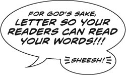
Words first, balloons second. It amazes me when students draw a word balloon first, then try to cram ten pounds of dialog into a five pound bag. The words get smaller and smaller the closer they get to the bottom of the balloon, until finally you're practically reading microfilm. Sheesh! This is such an easy problem to avoid: write your dialog first, take all the room you need, then draw a balloon around it when all the words are there. Problem solved.
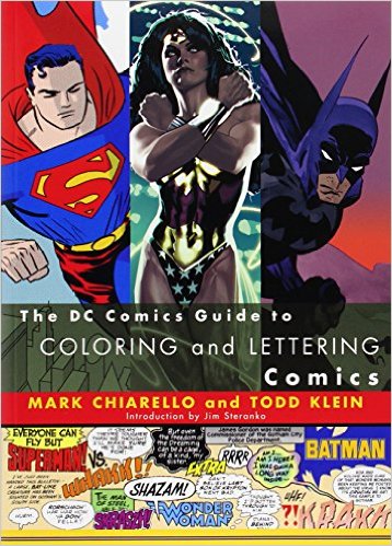
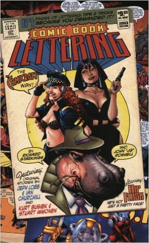 There are a lot more rules involved in good comic story lettering, and if you're on a quest for perfection you find a lot of them in Comic Book Lettering: The Comicraft Way or The DC Guide to Coloring and Lettering. But perfection aside, if you just follow the advice above I guarnatee your readers will at least be able to read the story you worked so hard on.
And then there's digital lettering...but that's a topic for another day! Stay tuned.
 My favorite artists/storytellers: David Wiesner
I first became impressed by David Wiesner's work in the most reliable way possible: by picking up one of his books cold off the shelf in a bookstore, buying it, and reading it to my kids. No reviews referred me to him; his books weren't recommended to me; no one told me he was an author/illustrator to watch. I just saw a book on a shelf and I fell for it on the spot.
Turns out he was sort of a big shot in the picture book world by the time I discovered him. But if you read his stories and see his artwork you'd ask yourself, "how could he not be"? His stories are always imaginative, surprising, funny and, well, kinda thrilling in their originality. And then there's the artwork—always beautifully executed and smartly in service to telling the story. These are the things Robots And Quicksand is all about, so it's high time I call your attention to Wiesner's work. And add to all this the fact that each time a new book comes out from Weisner you see he's pushing himself forward, trying something new, changing his style somehow. This is a rare thing in a successful artist. It's inspiring to see an already acclaimed artist constantly looking in new directions just because he's curious about what else he can do.
Instead of going on and on about Weisner's work and telling you where to find his books, I'll just send you to his web site. Take a look around there, and check out his books, either by buying them or finding them at your local library. Believe me when I say that no matter what age you are, if you enjoy a well-told story you'll enjoy Weisner's work.
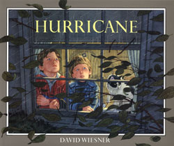
(FYI--that first book of Wiesner's that I picked up off the book shelf some twenty years ago was Hurricane, seen above. It's still one of my favorites.)
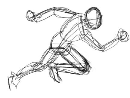
Anatomy of a drawing
When beginners see a completed, detailed drawing it can be an intimidating experience. The finished art can leave them wondering how such a polished creation can spring from nothing! The answer is: it doesn't—a finished drawing is the result of a series of baby steps that lead up to completion. Here's a step-by-step look at how I construct my figures:
First nail the pose. All the rendering in the world won't make a stiff, unbalanced figure work. The first step to success is to rough out a pose that works for you. Simple stick figures can suffice...
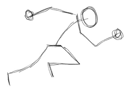
Now that you've got a clear pose planned out, you can start fleshing out the figure by loosely sketching. What you're really trying to do at this stage is make the figure dimensional, making body parts 3D, with a sense of volume, weight and proportion.
If that seems hard to wrap your head around, maybe thinking about it differently will help—try thinking of the arms, legs, torso, etc., as a series of tubes and boxes. (Those are easier to draw, right?) Simplifying complex body parts into simple-to-draw shapes will help you understand the dimensions of the body.
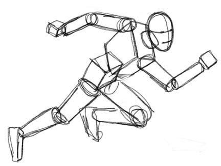
Now that you have a sense of the balance, dimension and proportion of the figure, you can proceed to refining the anatomy, giving definition to the muscles and other details. This is the part that will require the most practice. There's no substitute for the study and understanding of anatomy. It's something you learn from long hours of practice and observation.
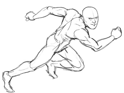
Now that you have a well-constructed figure you can begin adding the details that define who the figure is...
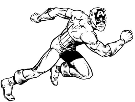
And since no respectable Red, White and Blue Living Legend of World War II would be caught dead in boring old black and white (or without a shield!)...
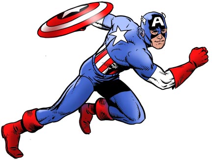
Okay, it may not be as easy as all that, but practice is the only way to get there—and planning your drawings out this way will help you make the leaps in improvement you're hoping for. So go ahead and start drawing, already!
Revisiting the King
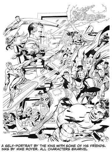
I wrote about Jack Kirby, the king of comics and the most important figure in the artform's history, way back here. Now I've found this online video telling you more about the man and his incredible skills as a storyteller, especially when depicting action. Look and learn from the master...
Thanks to the folks at Shapes On A Page for this video. Check out their YouTube channel. There's lots of good stuff there.
Recommended reading: Essential Fantastic Four, volumes 1-5. Find them at your favorite bookstore or library.
How to write a good beginning for your story
One of the toughest problems a writer can face is how to create a good beginning for your story. You may have a great idea to build your tale around, but if you don't engage the reader at the start they may bail on you before they even get to the good stuff. That's why you've got to start off with good stuff.
Nobody's better at story construction than the folks at Pixar. When you look at their track record over the years you find one classic movie after another. Pixar does many things well in the creation of their films, but the one thing that ties all their great films together is a focus on having a great story to built the movie around. Their approach to story construction is great path for any fiction writer to follow, whether you're working on movies, books, or comics. Here's a link to a terrific article by screenwriter Michael Arndt (Little Miss Sunshine, Toy Story 3) describing five steps for hooking your reader with a really great beginning—steps he encountered while working at Pixar. You can read Arndt's tips, or you can watch the video below, where he describes Pixar's ideas on grabbing your audience right from the start—and he uses examples from a few great Pixar movies to illustrate his points.
10 rules from for drawing comics
This week, instead of extolling my crazy theories about drawing and storytelling, I'm going to direct you to a site with advice from a long roster of experienced comics pros. It's called 10 Rules For Drawing Comics, and it has links to a bunch of smart artists who offer up just what the title says—a list of ten tips from seasoned comics veterans. Don't take every bit of advice offered there as law, but at least you should come away with some interesting, different perspectives on creating graphic stories. Check it out!
 Creating digital artwork
A large number of illustrators are moving away from old-fashioned pencil and paper to doing their artwork digitally. I'm one of them. Up until recently, the only really satisfying way of doing digital art involved some very expensive hardware and software: a pricey program like Painter or Photoshop (both costing hundreds of dollars), and a super-expensive computer monitor to draw directly on screen ($3,000). But now there are inexpensive, powerful apps that let you draw on your home iPad, and they're almost as good as the expensive stuff I just mentioned.
Of course, iPads aren't cheap. But a lot of families already have them to use as web browsers, game consoles, TVs, and all the other stuff iPads do so well. If you're lucky enough to have an iPad already, then your entry into the world of creating digital art may cost less than ten bucks! There are a bunch of drawing apps for iPad available at the App Store. Let me tell you about my favorite: Procreate. (That's Procreate's icon at the upper-right.)
Procreate costs a measly $5.99, but it's practically as useful as the monsterously expensive softwares a lot of professional illustrators use. Many of its tools and features works the same way as the expensive software, too: multiple layers, different digital brushes, pens and pencils, color mixers. All these great features are available to you in Procreate at the touch of your finger—and for less than the price of a movie ticket!
Procreate works on any iPad (sorry, I don't know if you can get it for non-Apple tablets), but if you really want to reach your full artistic capability you should try it on an iPad Pro with an Apple Pencil. Then you'll get pressure sensitivity (meaning the harder you press on the screen, the darker your mark shows up) just like with a real pencil! Here's a detail of a drawing I did in Procreate on my iPad Pro using Apple Pencil.
Looks just like my work with pen, brush and paper, right? It was all done on screen—from rough sketch to finished art! How cool is that?!
Sorry if this reads like a commercial for Procreate. I don't mean for it to be. I promise no one asked me to endorse this app, and if you buy a copy I won't make a dime from it. I'm telling you about it because it's a great, fun app that's a joy to draw and paint with, and it's dirt cheap. And don't think I'm telling you to set aside your pencils, paints and paper—artists will always use those things to create art. But artists are always open to new tools, and now you've got the chance to enter the digital art world just like the professionals!
You can learn more about Procreate by clicking here.
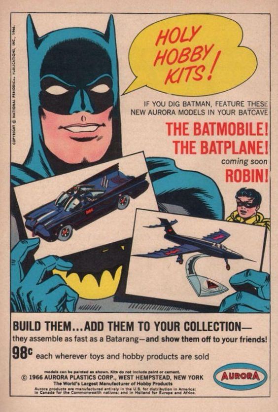 Copying your heroes
Stealing images from other artists is a very bad idea for professional artists (and it's a good way to get sued). But for kids learning how to draw, stealing is a great way to learn. The earliest drawings I remember doing in childhood were copies of comic book covers traced using carbon paper. (Carbon paper is a sheet of paper coated with a blackish-blue film on one side. When you traced on the top of the sheet the pressure transfered the blackish stuff onto a blank sheet under the paper. It's main use was to make a second copy as you typed letters on an old-fashioned typewriter—it was great for swiping drawings on Batman and Daredevil from the comic books.) Copying pictures created by my favorite artists as a kid taught me a lot about how to draw, and about what aspects of that art I admired—figure contours, proportions and rendering styles.
Tracing other artists work is a great way to understand it better. The next step in advancing your artistic skill is trying to copy a great artist just by studying their work closely—not tracing, but trying to recreate their work as closely as you can by looking hard at it and copying what you see. Doing this, you're bound start understanding what makes your heroes art tick, what makes it good to your eye. Once you start to understand other artists' work, you'll be on your way to picking and choosing what you want your art to be like, and understanding how to make it happen in the images you create on your own.
Copying your heroes is a great learning tool for young artists. Studying your heroes will give you a road map for where you want your own art to go. Don't worry too much that you'll end up a clone of your favorite artist—I can almost guarantee that even though you follow the path blazed by your heroes, you'll end up at your own destination eventually.
(FYI--the image of Batman in the ad shown above is the very first image I can remember copying using carbon paper. It's by two of my heroes, Carmine Infantino and Murphy Anderson.)
On the other hand: creative page layouts
In the previous post I wrote about making your comics page layouts clear so that you don't confuse the reader and take them out of the reading experience. However, that doesn't mean you can't get creative with your layouts. Some of the best comics artists can create wild layouts that actually add to the story. Here are some great examples...
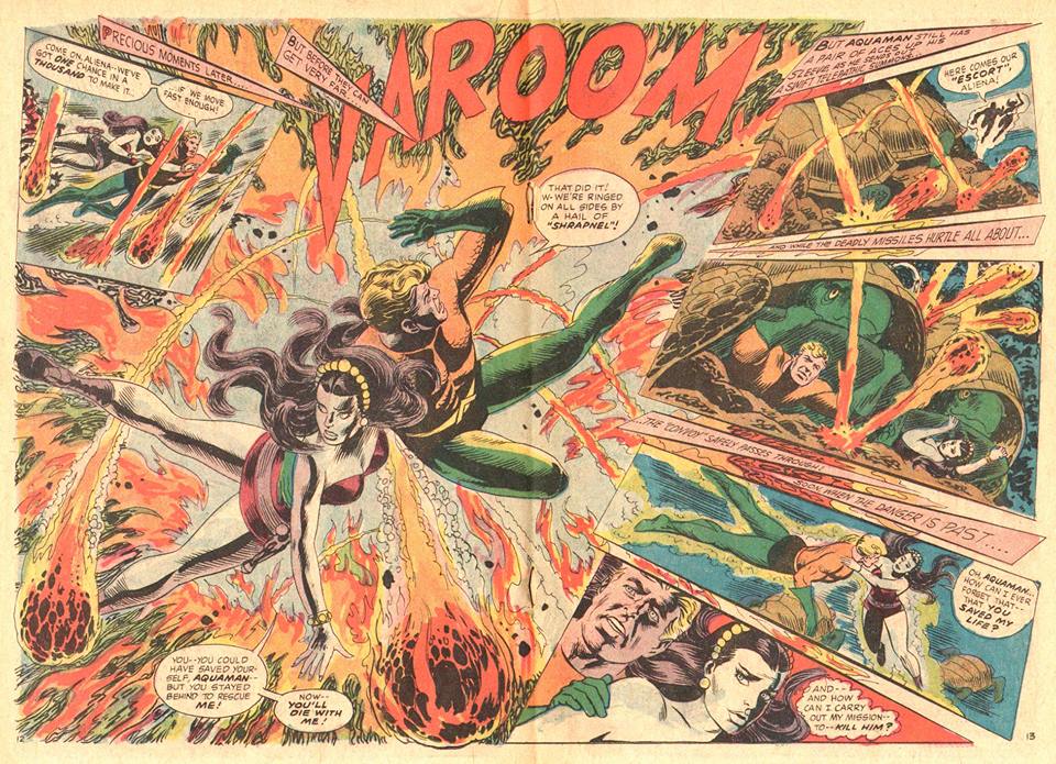
Above, artist Nick Cardy breaks apart the conventional panel grid to reinforce the impact of the explosion Aquaman is caught in. Notice the letterer had a challenge creating captions for this page, but the dramatic effect makes it worth the trouble.
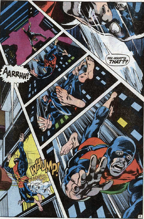
Here's a page from the great Neal Adams's run on The Uncanny X-Men. Notice the "Aarrhh!" baloon clues you in to where to start on this page, then the downward movement and growing figure of The Beast provides an inescapable path down and across the page. The daring layout graphically demonstrates the danger our hero finds himself in.

This one really pushes the limits! Of course it comes from professional limit-pusher Jim Steranko. During his time drawing S.H.I.E.L.D. he made almost every page a challange to the conventions of comics storytelling. Here he depicts a scene where Nick Fury has to find his way through a deadly maze, and the layout invites the reader to do the same. To read these panels in the correct order, you have to work your way through the maze puzzles that bridge the panels. You even have to turn the comic book as you go! Steranko challanges the reader to join Fury on the wild trip through the maze! This really adds a new dimension of fun to reading the story...and the challenge echoes the action in the story!
The lesson here: artists can break the rules...as long as it's in service to telling the story.
Recommended reading: Showcase Presents Aquaman, Volume 3 is full of Nick Cardy's fine work depicting the adventures of the King of the Seven Seas. The Uncanny X-Men reprints Neal Adams's stunning work on the teenage mutants. And check out Steranko's complete run on S.H.I.E.L.D. to see a real comics revolutionary at work.
 Job One for comics artists:
don't confuse the reader
When I teach my comics class for kids (at St. Louis's Center of Creative Arts [COCA]) the one point I nag the students about the most is this: don't confuse the reader! Kids are so enthused about getting their stories down on paper that they sometimes forget that someone besides them has to understand their comics. The young artists get caught up in wild panel arrangements and layouts, forgetting that a reader has to read the panels in the correct order to understand the story. Your reader's appreciation for your clever page design is going to be forgotten if they can't understand the story because they jumped from panel three to panel five to panel four. In comics, story trumps everything else: if the reader can't follow your storytelling, you failed—case closed.
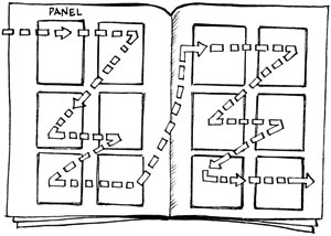
The basic navigation of reading a page of western comics is pretty simple: left to right, top to bottom, as in the above illustration. (Manga's rule are a bit different, but the ease of understanding them is the same as long as you're aware of the new rules.) Reading comics isn't rocket science unless the artist get's too "creative" for their own good. Take these examples from the excellent book, The DC Comics Guide To Coloring And Lettering Comics: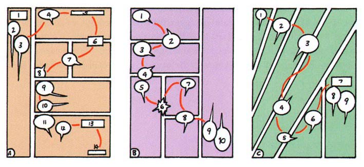 The reading order on the peach page is very clear, right? Wait. What's the deal with balloons 6, 7 and 8? That's not how it's supposed to work! The artist is asking the reader go against the natural order of the universe! They thought they could get away with the cheat by using caption 6 like a bridge to lead the reader, but I'll bet the reader hesitates for a second trying to follow that unnatural cue, and in that second he's taken out of the story. The arist should always want the reader IN the story! You can use ballooons to lead the reader, like in balloons 2, 6 and 8 on the pink page, but don't try to lead your reader in an unnatural path down the page (unless you've got a good reason to. More on that next week.)
The green page is an example of the artist getting creative with layout. It all works fine until the end—a reader could get momentarily confused about which panel is supposed to be the last to be read: the last panel on the page is the rightmost one, but it's also higher than the one before it. Okay, the reader will figure it out pretty easily in a second, but once again, in that second he's thinking about the path across the page instead of your story. That's a bad thing. The smart letterer's balloon arrangement comes to the artist's rescue, leading the reader from the top of panel four to the bottom, then bridging panels four and five with balloon #5. Nice save!
So try to put yourself in the readers' shoes as you plan your pages. You can be creative in your layouts, but don't sacrifice story clarity for your artistic whims.
Recommended reading: The DC Comics Guide to Coloring and Lettering by Mark Chiarello and Todd Klein (which is where the color diagram above comes from), and Comics And Sequntial Art (where the black and white illustration above comes from) by one of comics' true geniuses—Will Eisner. (More to come about Eisner one of these days. Stay tuned.)
 My favorite artists/storytellers: William Steig
Part of the fun of writing this blog is that I get to clue you in on other artists that I love. Today I'll tell you about one of the most admired artists in the history of picture books: William Steig.
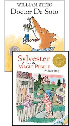
Steig had a long career in illistration,and he worked in many more areas that just picture books—for instance, he regularly did cartoons and covers for the high-brow magazine, The New Yorker. But he also wrote and illustrated kids' picture books, many of which have become classics. My two favorites are Doctor De Soto (about a mouse dentist that has to decide whether to risk helping a hungry fox suffering with a tooth ache), and Slyvester and the Magic Pebble (I won't describe the plot here, but Sylvester is as warm and moving a picture book as I've ever read).
Steig's art style is very loose and child-like, but there's much more there than you realize at first glance. His lines may be scraggly and his draftsmanship loopy, but this easy style serves a friendly, straighforward storytelling that reveals characters better than any other artist I know. Maybe you've heard the phrase "more is less" before, which means sometimes leaving out unnecessary details can be a better way to describe something—it's a phrase that fits Steig's work perfectly.
Steig's stories and drawings are all about showing the emotion and character of the story's subjects, whether they're people or pigs, donkeys or dragons, ogres or owls. One glance at one of Steig's characters and you know a lot about the personality of the person (or animal!) being depicted. Here's a great example:
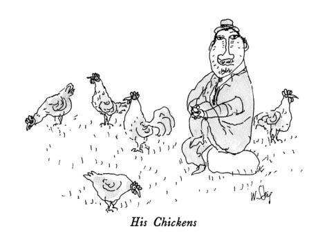
The wobbly lines and screwy anatomy aren't a sign of a bad artist; just the opposite. The style is very deliberate, making the drawing feel casual and somehow honest — as though the artist is more interested in revealing the thoughts of his character rather than how his arm connects to his shoulder, or how the light strikes him. This guy's straightforward gaze, smug pose and odd half-grin tell you a lot about how pleased he is to be lord and master of these chickens — this chubby, unshaven goof even wears a suit and hat to visit his chickens! In this one image there's a whole story to be found, but Steig leaves you to tell it to yourself.
Good visual storytelling. Nobody does it better than William Steig. He also demonstrates how style can be an important tool in storytelling—when depicting oddballs, it helps if you draw like an oddball.
Recommended reading: Any of Steig's award-winning picture books. Find them at your favorite bookstore or library.
Plan your pages with a thumbnail sketch
I see it over and over: young artists start drawing a page of comics—they draw the first panel completely. It turns out just the way they wanted. Now it's on to the second panel. Before long a second masterpiece sits beside the first! But then things start to go downhill. There's not as much room as you wanted on the page for the dramatic scene you planned for panel three, so you settle for a cropped version of that battle royal between the hero and the monster. By panel six you're cramming the action into the leftover space at the bottom of the page. You look over your handiwork. D'oh! you forgot to include something important you should've shown the reader way back between panels two and three! The page that started off so well has become a flurry of confusion and eraser marks.
Wanna know how to avoid this whole frustrating mess? Allow me to introduce the illustrator's best friend: the humble thumbnail sketch.
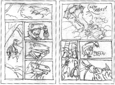
A thumbnail sketch is a simple, small, crudely drawn plan for your artwork that will will save you time and heartache. By scratching out a quick, rough layout for your page before you start drawing full-sized art, you can work out all the mechanics of how to tell your story, how big to make each panel, what appears in each box, and how the page works together as a whole. A five-minute thumnail sketch can spare you hours of headaches that come with bashing your way through panel after panel and hoping it all works out in the end. For my graphic novel, Dragon Girl, I did a thumnail sketch for every page in the book (192 in all) before I ever set pencil to paper on finished, full-sized artwork. That means that when I was ready to start real pages I was always sure just how I would tell the story as I began to draw— I could concentrate on drawing well since all my storytelling issues (pacing, camera angle, panel sizes) had been solved up front.
Your thumbnail sketch should be small; only three or four inches tall is fine. It should be rough — just clear enough that you can understand what you were trying to show the next time you look at it to begin your full-sized art. A thumbnail should be done quickly—just a few minutes of actual drawing, although the thinking involved in it may take longer. And if you do a thumnbnail you don't like, you put an "X" through it and do another. Try out a few differnet ways of laying out the page. For the cost of a couple minutes per sketch, you'll learn a ton about different ways to tell a story with pictures—and you'll quickly find the best way to tell your story!
Here's a look at my three-and-a-half-inches-tall thumbnails for pages 28 and 29 of Dragon Girl...
And here are the finished page that came from those simple, easy planning sketches...
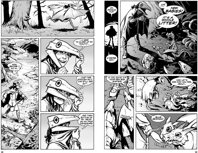
Notice there are some minor changes and adjustments I made from the thumbnails to the finished pages: see how I the added an extra panel at the start of page 29. Having a thumbnail doesn't mean you can't change your mind when you get a better idea!
So now you know: thumbnail sketches are an illustrator's best friend. From now on, make it your best friend, young padawan!
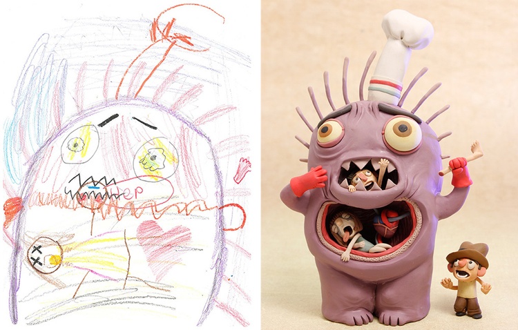
The Monster Gallery
One important part of telling stories with pictures is character design—creating a look for characters that reveals their personality and captures the imagination of the reader. I teach a course for kids in creating comics, and character design is always a key part of the program. The kids are never short on ideas for great characters, but often their skill at illustrating those ideas fall short of their imaginations' ability to think them up. Now, to solve this problem, comes The Monster Project!
Here's what The Monster Project is all about, in the words of its creator: "Kids draw monsters, then artists from all over the world recreate them in their own styles! We hope to help children recognize the power of their own imaginations and to encourage them to pursue their creative potential." That statement perfectly matches my hopes for RobotsAndQuicksand.com, so naturally I got a huge kick out of seeing the ideas kids drew up, and how the professional artists interpreted them. I guarantee there's a story to be told with every creature you find there. Go to the monster gallery and see for yourself how much fun creating monsters can be.
 The origins of Star Wars
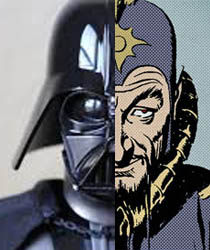
Artists' ideas don't appear from nowhere—creative folks are fuelled by the work of those that came before. You never escape the influences of your youth, and everyone follows in the footsteps of the creators they read and loved as a kid. Case in point: George Lucas.
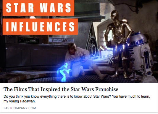
Audiences thought Star Wars was something fresh and original back when it first appeared in movie theatres in 1977. In many ways, it was. But George Lucas was also drawing on many old influences from his youth as he built his characters and universe. As the video link below demonstrates, some of the roots of Star Wars began long ago, in a movie serial and a newspaper strip far, far away— the action-packed panels of Flash Gordon.
Flash Gordon was an incredibly popular comic strip in the 1930s and 40s. It was created by one of the greatest, most influencial artists comics has ever seen, the fabulous Alex Raymond. Flash's science fantasy escapades (propelled by Raymond's masterful artwork) fired the imaginations of several generations of readers, and inspired countless creative souls to try and tell their own stories of action, adventure and imagination. Just ask the comic book creators of the 1940s and beyond...and ask George Lucas!
Kids love to use the books, comics and movies that inspire them as a sort of roadmap when trying to create their own stories and artwork. That's okay. Trying to recreate and recontruct the stories you love is a great way to learn your craft. And if you find a way to put a new twist on an old story, you might just inspire a whole new generation! Here's a perfect example...
Recommended reading: any of the books reprinting the classic adventure strip, Flash Gordon by Alex Raymond — especially the volumes containing his best work in the late 1930s. Find them at your favorite bookstore or library.
What happens between the panels in comics
When creating pictures that tell a story, the most important decisions the artist makes are about what to put in the illustration. But what to leave out can be just as important to the success of your story. What happens unseen between the panels can be as important to the story as what you do see. Below is a great of example of what I'm talking about:
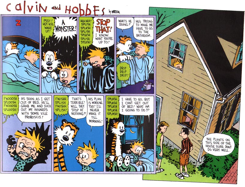
Think about what you don't see in this great Calvin and Hobbes Sunday strip from 1992: you don't see the main thing Calvin is worried about—the monster under the bed. Why do you think that is? Is the monster real or not? Is it less scary or more scary because we don't get to see it? How about the important event we don't see that happens between the last panel and the one right before? What we don't see is the punch line to the whole strip! By not showing the most important part of the story Bill Watterson (Calvin and Hobbes' brilliant creator) asks us, the readers, to use our brains to fill in the events between the panels. That makes us participate in the creation of the story, and that makes the surprise of the outcome even funnier than if we saw how Calvin solved his problem.
In comics, sometimes it's what happens between the panels that counts.
Recommended reading: any book with Calvin and Hobbes by Bill Watterson. Find them at your favorite bookstore or library.
 In the end, kids decide for themselves what they like.
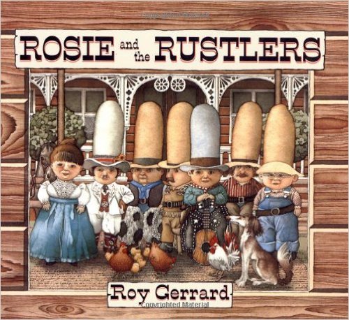
Picture books and comics come in all different sizes, shapes, styles and kinds. They can be in full color...or black and white...or painstakingly detailed...or cartoonish and simple...or very serious...or dopey fun...or, well, you get the idea. There are many kinds of books for many kinds of people. Looking at the variety of books available and seeing how readers respond to them tells me one thing: I think we can all agree that we can't ALL agree on anything! Case in point: Rosie and the Rustlers.
Rosie and the Rustlers was a picture book I loved to read to my kids, Alli and Pete, when they were growing up. My wife, Kim, loved to read it to them too. Beautiful, elaborate, funny illustrations; clever rhyming text; a rousing adventure of cowboys tracking down bad guys in the old west—what's not to like?
I found out years later that my kids hated reading Rosie and the Rustlers.
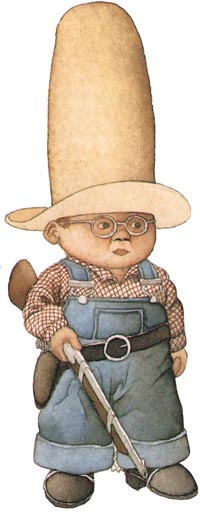
Is turns out Alli and Pete let their clueless parents read it to them every once in a while in much the same way that they occasionally ate broccoli when they found it on their plate. Now that my kids are old enough to express themselves more clearly than they could when they were four, they can tell me what their problem was with Rosie: she and her cowboy pals were CREEPY! Above you see one of the heroes of the book: a beautiful caricature of a cowboy rendered in delicate watercolors...or a weird, stubby western munchkin with a head like a bowling ball stuffed into a crazy hat? You decide.
And that's the point here—the reader gets to decide. That can be a tough realization for an artist. Rejection and criticism are a bigger part of being an artist than beginners realize. Roy Gerrard, the author and illustrator of Rosie and the Rustlers, was a respected artist with many wonderful picture books to his credit. Many people loved his work, me and my wife included...
...but Alli and Pete decided Rosie and the boys were creepy. Case closed.
 As Rosie might have said, "You can lead a horse to water, but you can't make him drink." Do your best work. Make yourself happy. Listening to criticism is important and helpful to a growing artist, but understand you won't please everyone all the time—just ask Rosie.
Recommended reading: you can find Rosie and the Rustlers here or at your local library or bookstore. I think it's a great book, although Alli and Pete beg to differ.
 Jack Kirby: The King of Comics
In this, my very first post on The Drawing Board, it seems only right to fill you in on the greatest comics creator of all time; a guy so influencial to graphic storytelling that in comics' circles he's referred to as "The King".
I teach drawing comics at St. Louis's Center of Creative Arts (COCA), and when I mention this comics creator I usually get blank stares from the 8-14 year-olds in the class. He's not as famous as one of his old partners, Stan Lee, but Kirby is...well...THE KING to adults interested in comics. Still, as famous as Kirby is to adult comics' creators, this blog is written for young people interested in graphic storytelling, and if you're young everything's new to you at some point. With that in mind, it's time you knew this name:
Jack Kirby.
Kirby started his career at the dawn of comics back in the 1930s. Over six decades (he died in 1994) he created or co-created Captain America, Thor, the Fantastic Four, Iron Man, the X-Men, the Hulk, Doctor Doom, Magneto, Darkseid...oh...forget the list. The number of characters Kirby created is way too long to plow through here. The world is awash in Kirby's creations in the pages of comics and on movie and TV screens. Take a look at Kirby's Wikipedia page to get the basics of what he gave to the world.
Kirby was more than a great character designer. He also created a lot of the "visual vocabulary" of comics—how comics tells a story. Dynamic figure drawing, outlandish settings, story pacing, exciting camera angles, and on and on... He came up with a unique rendering style that matched the energy of his stories and characters, and fit beautifully with the cheap, limited printing process comics books used. He was comics' truest genius.
Kirby's contibutions to comics were endless. Chances are I'll be writing about the lessons Kirby's work has to offer young visual storytellers like you in many future posts. But for now, your best lessons in drawing comics awaits you in any of the many, many books you can find with Kirby's work between the covers. Go to Amazon or any other bookstore and you'll find a world of wonder awaits you inside anything with Jack's name on it. (My favorite is his work on the first 102 issues—that's right, 102 issues!—of The Fantastic Four.) You'll also be exposed to the best display of comics storytelling in the world.
Jack Kirby. Know the name. Read the work. You'll never get a better lesson in how to tell fantastic stories with fantastic illustrations.
Recommended reading: Essential Fantastic Four, volumes 1-5. Find them at your favorite bookstore or library.